Colour psychology is the study of how colours affect perceptions and behaviors. In marketing and branding, colour psychology is focused on how colours impact consumers’ impressions of a brand and whether or not they persuade consumers to consider specific brands or make a purchase. It might seem minor, but colour is a big consideration when creating marketing assets, building a new business, or rebranding an existing one.
Did you know, in a study titled “Impact of colour on marketing,” researchers found that up to 90% of snap judgments made about products can be based on colour alone?
There have been many attempts to classify how people react to different individual colours: But the truth is that colour is too dependent on personal experiences to be universally translated to specific feelings. Personal preferences, experiences, upbringings, cultural differences, and context muddy the effect that individual colours have on us.
How to make practical decisions about colour in your marketing and branding
The question I’m most asked regarding branding is ‘what colours should I go for?’ Some clients want to go for colours that they are naturally attracted to whilst others imbue different colours with different meanings
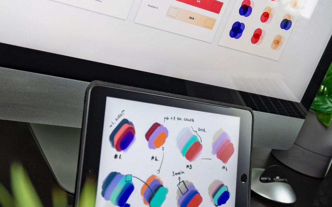
There are no clear-cut guidelines for choosing colours for your brand. While it would be nice to be able to simply look at an infographic and make the right decision, it depends on many factors.
The context you’re working within is an essential consideration. It’s the feeling, mood, and image that your brand or product creates that matters. Research into the psychology of colour can help you make the right choice.
The right colour is appropriate for your brand
In a 2006 study, researchers found that the relationship between brands and colour hinges on the perceived appropriateness of the colour being used for the brand. In other words: Does the colour fit what’s being sold?
When it comes to picking the “right” colour, research has found that predicting consumer reaction to colour appropriateness is far more important than the individual colour itself.
For example, red is seen as a colour of wealth in Asia and is used by a lot of global banks, blue is seen as a very corporate, no-nonsense colour that is used by a lot of big consultants, accounts and legal firms. Primary colours are used by brands that want to appeal to a child audience – think of LEGO and McDonalds and purple is seen to denote luxury and royalty – think Cadburys.
Before the Florida oil spill, Marketing Week undertook a survey of the 10 greenest companies in the UK and BP was on the list! Is it to do with the colour of its brand or a great PR team? Whatever the case, you have to question a public that puts an oil company as one of its top 10 most environmentally friendly brands.
The right colour shows off your brand’s personality
Colours influence how customers view the “personality” of the brand in question.
And while certain colours do broadly align with specific traits, nearly every academic study on colours and branding will tell you that it’s far more important for colours to support the personality you want to portray instead of trying to align with stereotypical colour associations.
Psychologist and Stanford professor Jennifer Aaker has conducted studies on this very topic, and her paper titled “Dimensions of Brand Personality” points out five core dimensions that play a role in a brand’s personality.
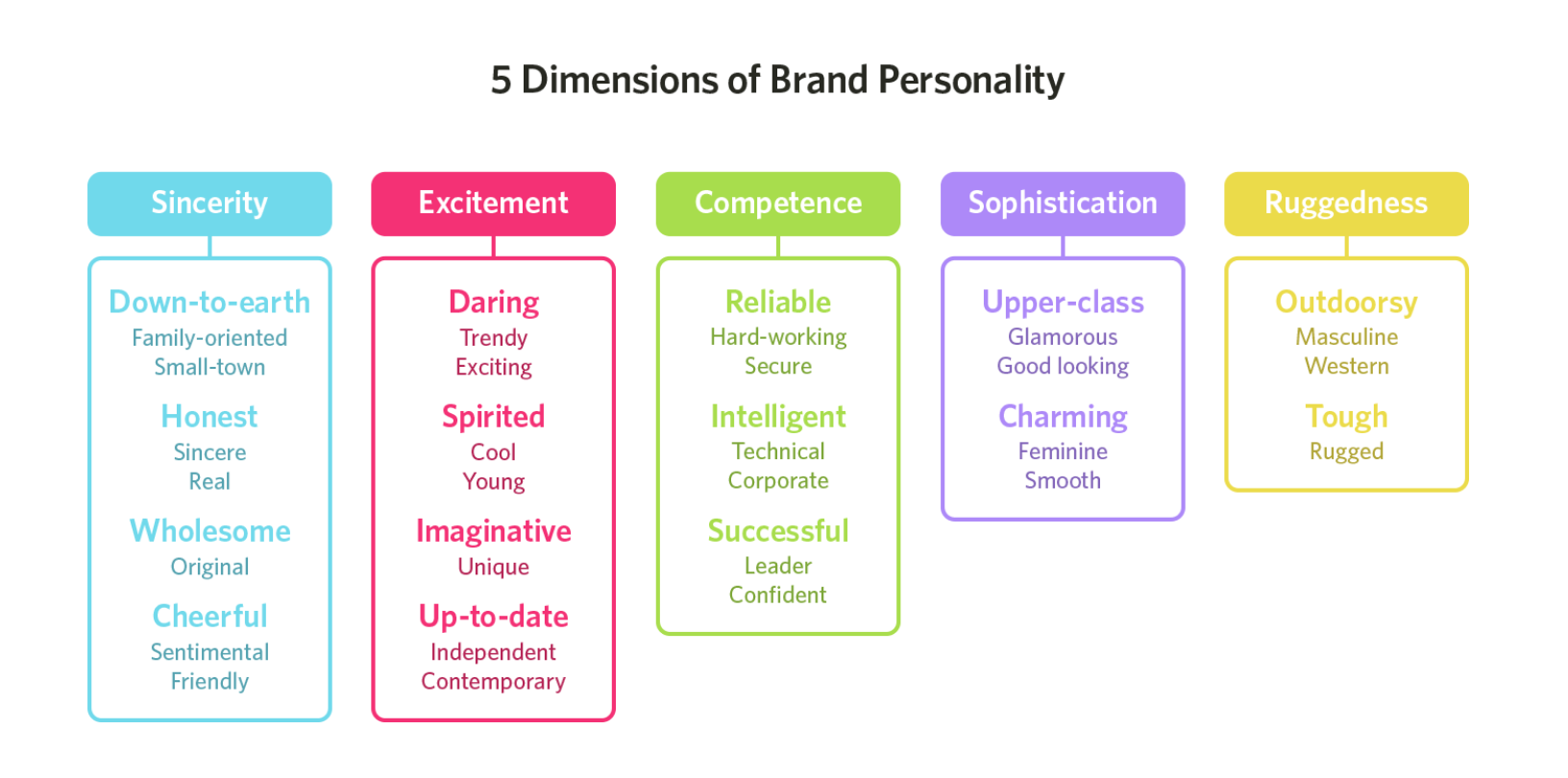
Brands can sometimes cross between two traits, but they are mostly dominated by one.
Ask yourself: what do I want my brand’s personality to be, and how can I use colour to convey that personality?
The right colour appeals to your audience
Research shows that when it comes to shades, tints, and hues, men generally prefer bold colours while women prefer softer colors.
Although this is a hotly debated issue in colour theory. Brands can easily work outside of gender stereotypes.
The right colour differentiates your brand
Additional studies have revealed that our brains prefer immediately recognisable brands, which makes colour an important element when creating a brand identity. It’s important for new brands to pick colours that ensure differentiation from entrenched competitors.
Research clearly shows that participants can recognise and recall an item far better, be it text or an image when it blatantly sticks out from its surroundings.
Two studies on colour combinations, one measuring aesthetic response and the other looking at consumer preferences, found that while a large majority of consumers prefer colour patterns with similar hues, they also favour palettes with a highly contrasting accent colour.
In terms of colour coordination, this means creating a visual structure consisting of base analogous colors and contrasting them with accent complementary colours.
The right colour has the right name
Although different colours can be perceived in different ways, the descriptive names of those colours matter as well.
When people are asked to evaluate products with different colour names, such as makeup, fancy names are preferred. For example, “mocha” was found to be significantly more likable than “brown,” even though the same colour as shown.
Additional research finds that the same effect applies to a wide variety of products; consumers rated elaborately named paint colours as more pleasing to the eye than their simply named counterparts.
It has also been shown that more unusual and unique colour names are preferable for everything from jelly beans to sweatshirts. For instance, crayon colors with names such as “razzmatazz” were more likely to be chosen than names such as “lemon yellow.”
Finding your own palette
There’s still no cheat sheet for choosing the perfect colour or colour scheme. There is no definitive answer. But, it doesn’t mean we should stop thinking critically about it. Use the research available to challenge preconceived notions and to raise better questions; it’s the one consistent way to reach better answers.


